

A new bus stop sign redesign
Why change this distinctive sign of your daily life?
In anticipation of the commissioning of future REM antennas, we had to adjust the signs in order to add, among other things, the REM pictogram. We took advantage of the opportunity to redesign the template according to current signage standards and our brand image! A project carried out entirely by our teams.
The stop sign is a central customer information tool in the customer trip, and also a strong identity element for the STM and its image in the city. It is a landmark for the visibility and promotion of public transport.
Did you know that before 1928, our buses stopped anywhere on their route? Dedicated stops with signs were introduced 97 years ago to reduce downtime, improve journey times and locate stops quickly!
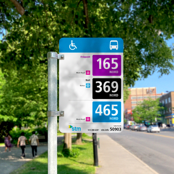
What's new on the bus stop sign
Graphic design principles were applied to better prioritize information and make it easier for customers to read.
Optimizing visibility
The line number is 17% more visible, the type of service 148% more visible and connections to other modes 35% more visible.

Optimized alignment
The information is pushed outwards to improve visibility when the sign is hung.
Brand image update
The STM's blue is back, our logo is back in color and our signage standards are consistent with those of the metropolitan area.
Prioritizing information
Addition of the REM pictogram. Reduction of internal information and prioritization of other modes' connections.
Signs will be changed gradually over several years, according to operational needs. Around 30 signs are changed every week due to breakage, changes or vandalism.