
New metro signage
Over the last few years, a family of new signage tools has been deployed in the métro network. Its purpose is to make it easier for customers to find their way around while using public transit.
Not sure what we mean by signage? See below. We explain what it means.
The new signage differs from the past one thanks to a modern, structured approach, with a design inspired by best practices worldwide. It considers the specific needs of different groups of customers and is adapted to the layout of each station.
It is the result of close collaboration between members of a cross-disciplinary team made up of industrial and graphic designers, architects, engineers, consultants in the field of universal accessibility and specialists in métro operations.
This video was produced when the new signage was launched. Watch it to learn more about the changes you may have seen in recent years across the métro network.
Questions and answers
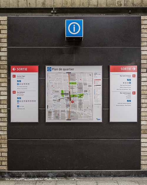
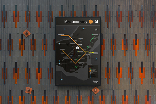
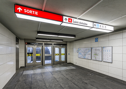
Signage refers to a group of visual elements that, collectively, serve to convey one’s location or find one’s direction while on the move. In tangible terms, signage in the métro network includes all the elements identifying a station, directional signs, plans and maps .
The graphic design was completely overhauled to produce a more streamlined and contemporary look, consistent with the STM’s corporate brand image, while also maintaining certain vintage elements.
The information is now presented in a more logical, consistent and prioritized way to minimize the effort required to remember it. It meets high performance standards in terms of visibility, legibility, clarity, coherence and information structure.
To achieve this result, various aspects were given much thought:
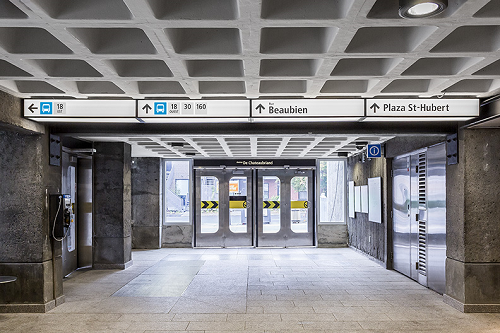
- Using the arrow
- Changing the typography
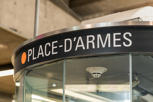
- Using colour
- Introducing lowercase letters
- Updating pictograms
- Restyling the métro network map
- Refashioning station vicinity maps
- Adding a compass rose
- Identifying exits
- Maintaining vintage elements
In terms of industrial design, all of the structural elements, such as frames, free-standing sign posts and anchoring systems, were all redesigned. This enabled us to improve their assembly, standardize their components and create a harmonious look that is still mindful of the past. Particular attention was paid to how they can be dismantled, so that these elements could be easily recovered and moved, if needed, at a later date.
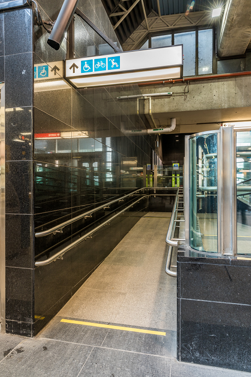
The information will be presented more clearly while being easier to understand. This will help customers get their bearings more easily, whether they are regular or occasional transit users, tourists, or someone with a visual, motor or intellectual disability.
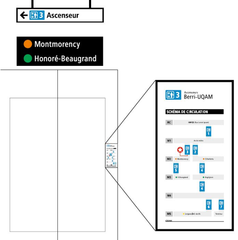
In stations with multiple levels accessible by elevator, such as Berri-UQAM or Jean-Talon, the elevators are numbered.
There are vertical maps of the elevators to help you visualize the route through the station’s different levels.
When planning your route, it’s a good idea to write down or memorize the order in which you must take the elevators to get to the right platform.
A pilot project was undertaken at Jean-Talon and Henri-Bourassa stations. Its purpose was to test a variety of signage tools in actual conditions and to collect comments and suggestions from customers. Many of you expressed your opinion during the project and this influenced our final choices.
Representatives from the disabled community were also consulted so we could get a better understanding of their needs. We considered everything: from the degree of contrast required so a visually-impaired person can read the signs to the optimal height for a map on a wall so a wheelchair user can study it more easily.
The new signage has been rolled out in these stations:
- Angrignon
- Assomption
- Atwater
- Beaubien
- Berri-UQAM
- Charlevoix
- Crémazie
- Guy-Concordia
- Honoré-Beaugrand
- Jean-Drapeau
- Jolicoeur
- Joliette
- Laurier
- LaSalle
- Lionel-Groulx
- Place-d’Armes
- Préfontaine
- Square-Victoria – OACI
- Radisson
- Viau
The new signage is being rolled out gradually, depending on the type of work being done in each station, and has been partially installed at the following stations: Édouard-Montpetit, d’Iberville, McGill, Mont-Royal, Outremont, Pie-IX, Place-des-Arts.
This is a temporary list and could be modified over time, according to the priority given to worksites.
The new signage will be rolled out gradually. As the deployment of these new tools sometimes requires electrical or architectural work, we will proceed whenever major refurbishment work is undertaken.
A gradual rollout was a conscious choice, a decision based on the STM’s financial situation. The step by step approach will result in an economy of scale of some 40%.
Yes, eventually, we will update all of the bus network’s signage tools, but it is still too soon to set a date. Members of the public will have the opportunity to voice their opinion as part of another pilot project, during which an initial version of the new tools will be tested.
The design phase is entirely funded by the STM. However, 75% of the production and installation costs for the signage tools is funded by the Ministère des Transports du Québec, as the rollout falls within the scope of major refurbishment work and is included in our Réno-Infrastructures program.
Learn more about the métro's initial signage
STM’s team of designers and architects who worked on updating and standardizing the signage recently met with Laurent Marquart, who designed the métro’s initial signage.
Their conversation with Laurent began in 2013, during meetings with various design professionals. Recently, the team expressed its interest in meeting with him again so that he could comment on the team’s work.
Laurent's stong skills as a generalist led him to work on several multidisciplinary design projects during his career. He agreed to share his experience and thoughts with the team that is revisiting the work he did in the 1960s.
Laurent, the communicator, spoke first. "I was against using 'A' and 'B' to designate exits. I knew that, elsewhere in the world, other means were used, like the cardinal points. And yet, using these letters is like using a new language. And it works, within the precise framework of the Montreal métro! You found the best solution."
Then, Laurent, the designer, continued by saying "I find it remarkable that by daring to remain humble, you have succeeded in doing something different. The initial choice was to keep the typography simple. By revisiting it, you did not pretend to be better. You also chose the simplicity and effectiveness of visual communication. It could have been much more sophisticated in terms of industrial design. However, the chosen approach respects the original concept of blending signage with the architecture of the stations."
Laurent made the following conclusions about the new signage: "Its simplicity shows cultural maturity. Some métros have become icons not because they are exceptional, but because their image weathers the passage of time. That is what will happen here. With the métro, its signage is part of the city’s brand. To respect it is to respect the heritage of this city."
New metropolitain signage
From a vision of harmonization, regional cohesion and sustainable development, the Autorité régionale de transport métropolitain (ARTM) began a redesign of signage across its territory in 2018.
The Société de transport de Montréal was mandated to set up a project office to develop integrated and consistent metropolitan signage standards inspired by best practices from around the world.
For the first time in its history, the Greater Montréal area now has an integrated and consistent public transit network map.
The new signage will gradually appear in the métro, bus terminals, train stations, the REM, park-and-ride lots, and other transit infrastructure on the ARTM’s territory.
Find out more about this ambitious project on the Autorité régionale de transport métropolitain website.